Notice that there are too many columns in the data, we will only employ several useful variables in or exploratory data analysis.
3.2 Distribution of Churn
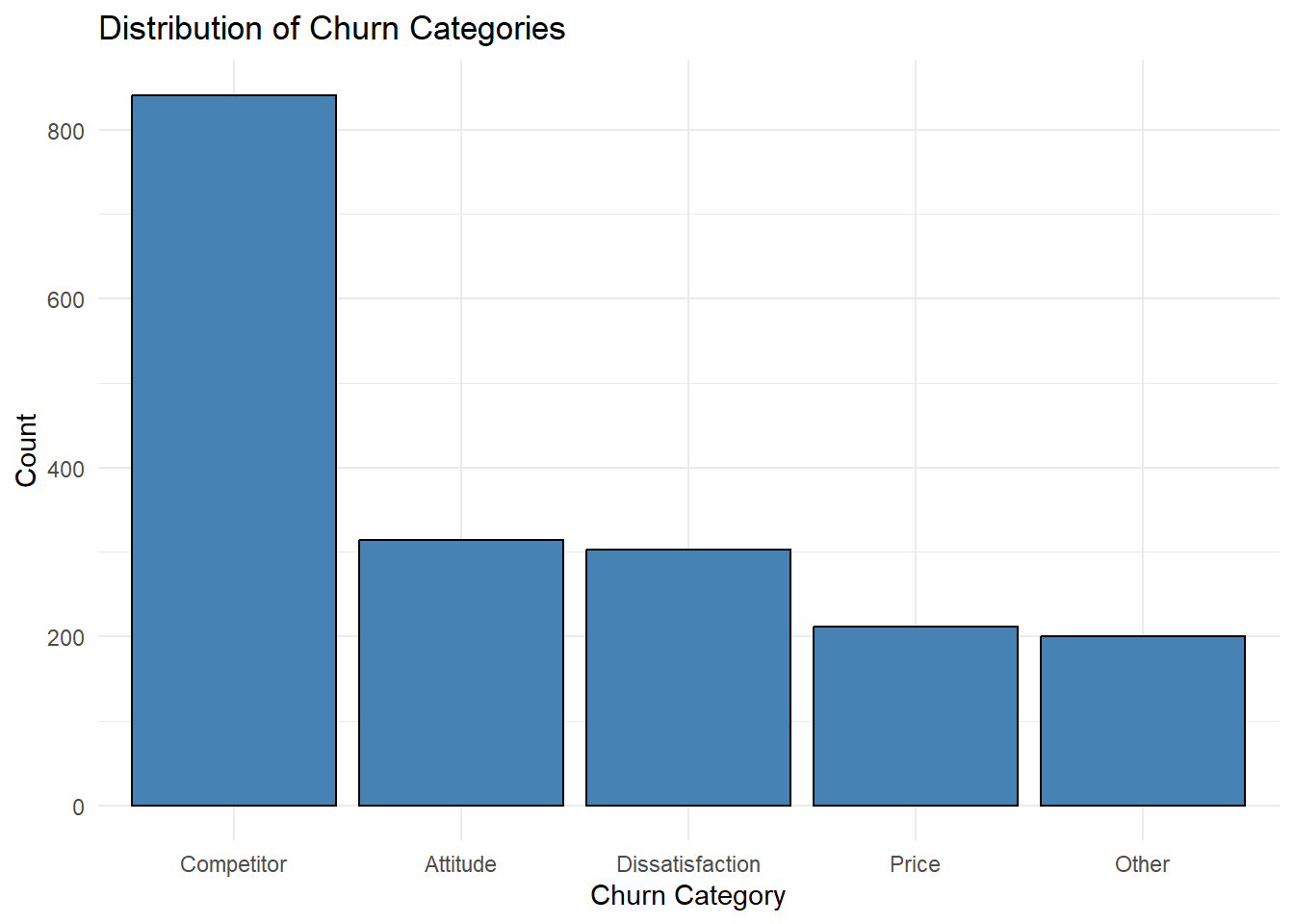
First, let’s use barplots to have a look into the distributions of Churn Category and Churn Reason.
Code
ggplot(cleaned_data, aes(x =fct_infreq(`Churn Category`))) +geom_bar(fill ="steelblue", color ="black") +labs(title ="Distribution of Churn Categories", x ="Churn Category", y ="Count") +theme_minimal()
From the barplot for Churn Category, we can see that the biggest category is competitor, which is way higher in count than all of the other categories. It suggests that the most reason for customer churn is related to the competition among businesses. We can further verify this by checking the frequency for the specific reasons for customer churn as follows.
Code
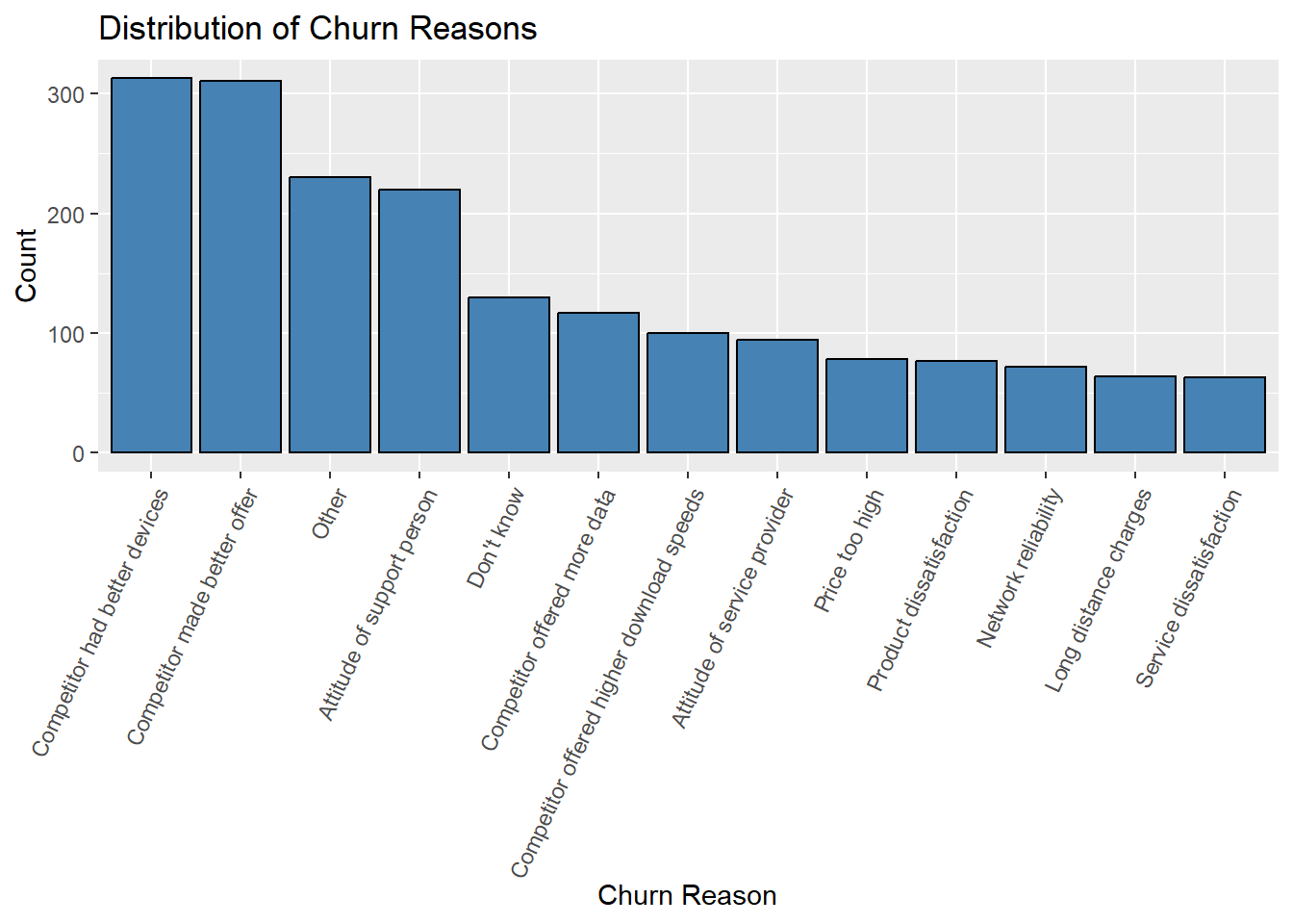
cleaned_data$`Churn Reason_lumped`<-fct_lump_n( cleaned_data$`Churn Reason`, n=12, other_level ='Other')ggplot(cleaned_data, aes(x =fct_infreq(`Churn Reason_lumped`))) +geom_bar(fill ="steelblue", color ="black") +labs(title ="Distribution of Churn Reasons", x ="Churn Reason", y ="Count") +theme(axis.text.x =element_text(angle =65, hjust =1))
Since we have many unique reasons in Churn Reason variable, we used lump to show the most 12 frequent reasons in the graph, and the rest of the reasons fall into reason other. From the graph, we can see that there are 4 competitor related reasons in the most 7 frequent reasons, including better devices, better offer, more data, and higher download speeds. Attitude of support person and provider are also frequent reasons, which is in accordance with the graph for Churn Category.
3.3 Influences on Churn Categories
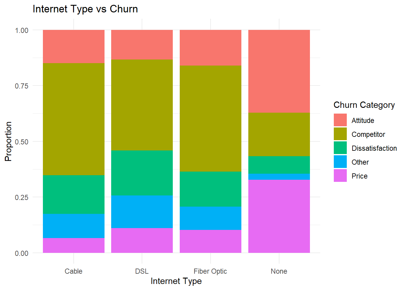
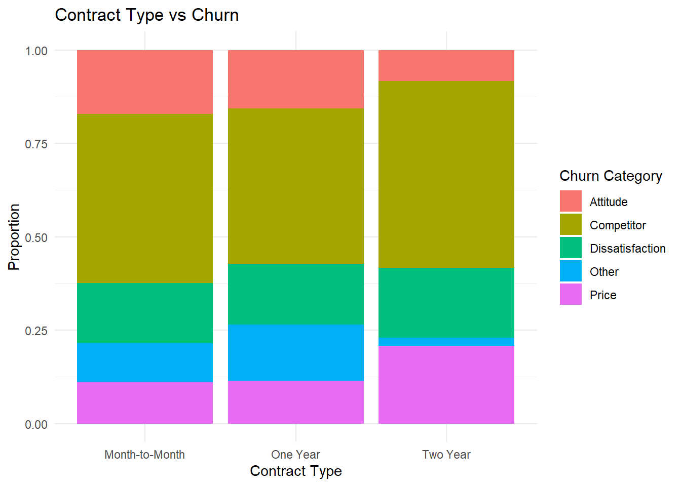
Now, let’s introduce three important factors into discussion: Internet Type, Contract Type, and Unlimited Data (Yes or No). In hypothesis, one’s churn reason may be influenced by a company’s plan. We will create 3 stacked bar charts to see how Churn Category is influenced by those 3 factors.
Code
# Internet Type vs Churnggplot(cleaned_data, aes(x =`Internet Type`, fill =`Churn Category`)) +geom_bar(position ="fill") +labs(title ="Internet Type vs Churn", x ="Internet Type", y ="Proportion") +theme_minimal()
Code
# Contract Type vs Churnggplot(cleaned_data, aes(x =`Contract.y`, fill =`Churn Category`)) +geom_bar(position ="fill") +labs(title ="Contract Type vs Churn", x ="Contract Type", y ="Proportion") +theme_minimal()
Code
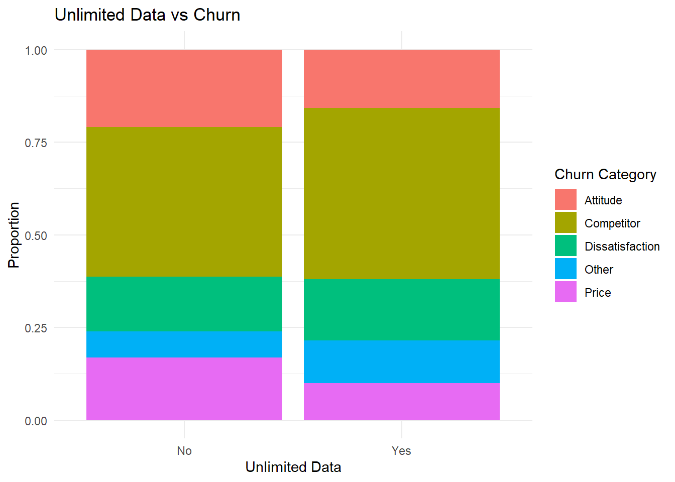
# Unlimited Data vs Churnggplot(cleaned_data, aes(x =`Unlimited Data`, fill =`Churn Category`)) +geom_bar(position ="fill") +labs(title ="Unlimited Data vs Churn", x ="Unlimited Data", y ="Proportion") +theme_minimal()
From the 3 stacked bar charts, we can see that for most of the plans, competitor is the most category for a customer to churn. This suggests that no matter for what plans a customer is paying, they would all check other companies’ plans and switch to the other if they find it more favorable. However, there is one exception: when customers choose to have None for internet type, supporter’s or provider’s attitudes tend to be the most reason for their churn. Price also becomes a better reason than competitor. This suggests that customers who do not care about internet in their service may pay more attention to service attitude and prices.
3.4 Service Related Variables and Churn
Code
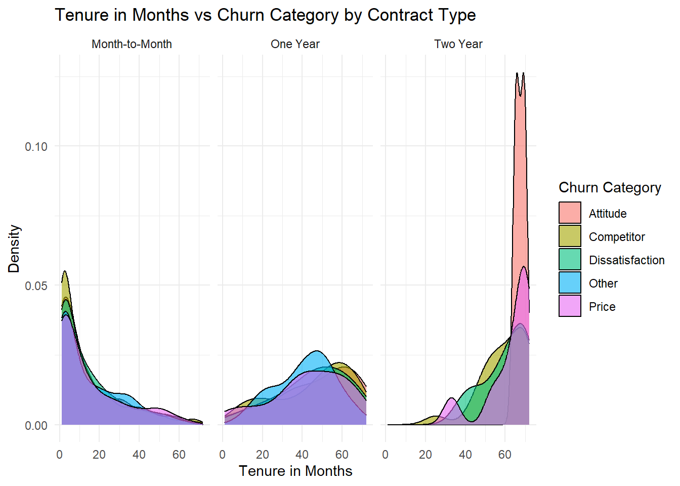
# Contract vs Tenure vs Churn Categoryggplot(cleaned_data, aes(x =`Tenure in Months`, fill =`Churn Category`)) +geom_density(alpha =0.6) +facet_wrap(~`Contract.y`) +labs(title ="Tenure in Months vs Churn Category by Contract Type",x ="Tenure in Months",y ="Density" ) +theme_minimal()
The graph titled “Tenure in Months vs Churn Category by Contract Type” provides valuable insights into the relationship between customer tenure and churn categories across different contract types. For the “Month-to-Month” contract, we see a wide distribution of tenure, with a peak around 10 months, indicating that many customers churn within the first year. The “One Year” contract shows a more concentrated distribution, with a peak above 40 months, suggesting customers are more likely to remain for the duration of their contract. The “Two Year” contract exhibits a bimodal distribution, with one peak around 24 months and another around 2-3 months, indicating that some customers fulfill their contract while others churn early. The different churn categories, such as “Attitude,” “Competitor,” “Dissatisfaction,” and “Price,” are represented in varying degrees across the tenure distributions, providing the telecommunications company with insights to develop targeted retention strategies based on contract length and the underlying reasons for customer churn.
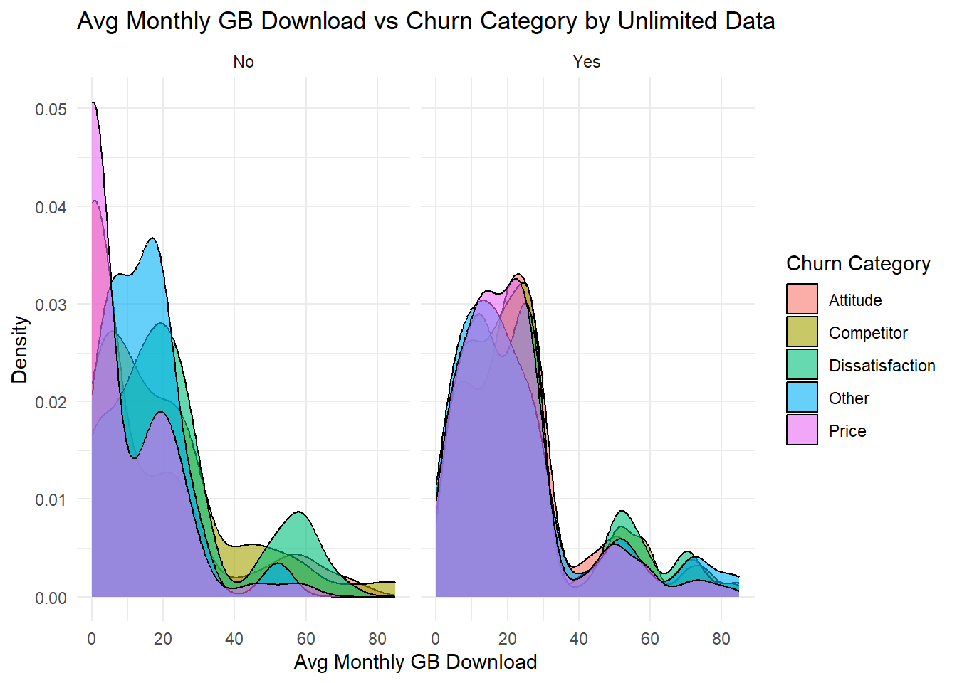
The graph titled “Avg Monthly GB Download vs Churn Category by Unlimited Data” provides insights into the relationship between average monthly data usage and customer churn categories, based on whether the customer has an unlimited data plan or not. For customers without unlimited data, we see a wide distribution of average monthly data usage, with the churn categories “Competitor” and “Dissatisfaction” having the highest data usage, indicating that these customers may be more likely to churn due to reaching data caps or experiencing slower speeds. In contrast, for customers with unlimited data plans, the distribution of average monthly data usage is much more concentrated, and the churn categories are more evenly distributed across the data usage range, suggesting that for unlimited data customers, factors beyond data usage, such as network reliability, customer service, and perceived value, may play a more significant role in their decision to churn. This information can help the telecommunications company better understand the drivers of customer churn and develop targeted retention strategies.
Code
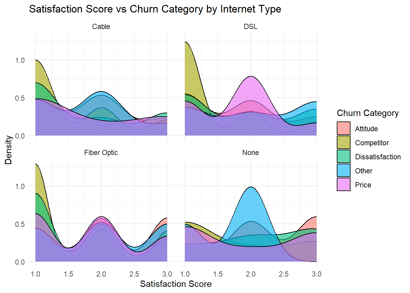
ggplot(cleaned_data, aes(x =`Satisfaction Score`, fill =`Churn Category`)) +geom_density(alpha =0.6) +facet_wrap(~`Internet Type`) +labs(title ="Satisfaction Score vs Churn Category by Internet Type",x ="Satisfaction Score",y ="Density" ) +theme_minimal()
The graph titled “Satisfaction Score vs Churn Category by Internet Type” provides an insightful look into the relationship between customer satisfaction and the reasons for customer churn across different internet service types. For Cable internet customers, the satisfaction scores show a bimodal distribution, with peaks around 0.5 and 1.0. The “Fiber Optic” category exhibits the highest satisfaction scores, while the “None” category (likely representing non-churning customers) also has relatively high satisfaction. In contrast, the “Competitor” and “Dissatisfaction” categories show lower satisfaction scores, indicating that these factors play a significant role in driving churn for Cable customers. The DSL internet customers present a different pattern, with the “None” category again showing the highest satisfaction scores, peaking around 1.0. The other churn categories, such as “Attitude,” “Competitor,” and “Price,” have more varied satisfaction distributions, suggesting that for DSL customers, the reasons for churn are more complex and not solely driven by satisfaction. This information can help the telecommunications company better understand the nuances of customer satisfaction and its relationship to churn across their different internet service offerings. By analyzing these insights, the company can develop more targeted retention strategies to address the specific factors influencing customer loyalty and churn.
Code
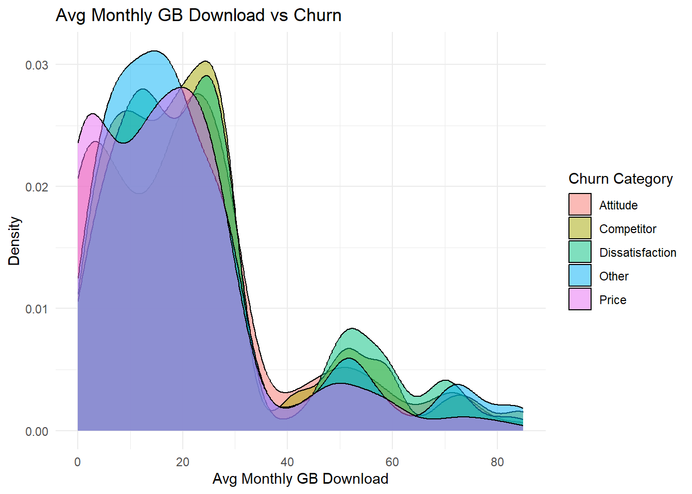
ggplot(cleaned_data, aes(x =`Avg Monthly GB Download`, fill =`Churn Category`)) +geom_density(alpha =0.5) +labs(title ="Avg Monthly GB Download vs Churn", x ="Avg Monthly GB Download", y ="Density") +theme_minimal()
Code
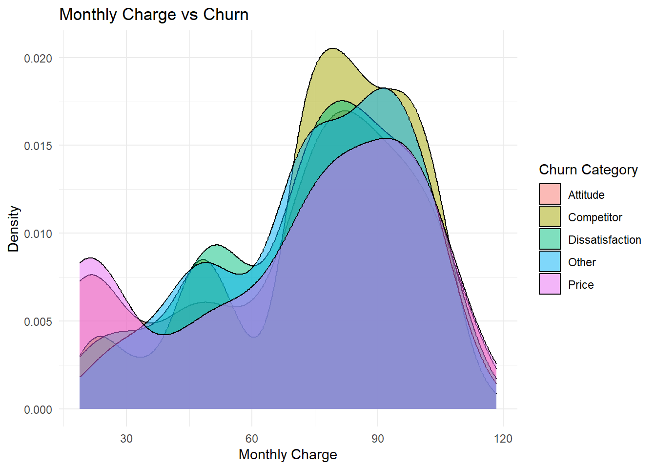
ggplot(cleaned_data, aes(x =`Monthly Charge`, fill =`Churn Category`)) +geom_density(alpha =0.5) +labs(title ="Monthly Charge vs Churn", x ="Monthly Charge", y ="Density") +theme_minimal()
Code
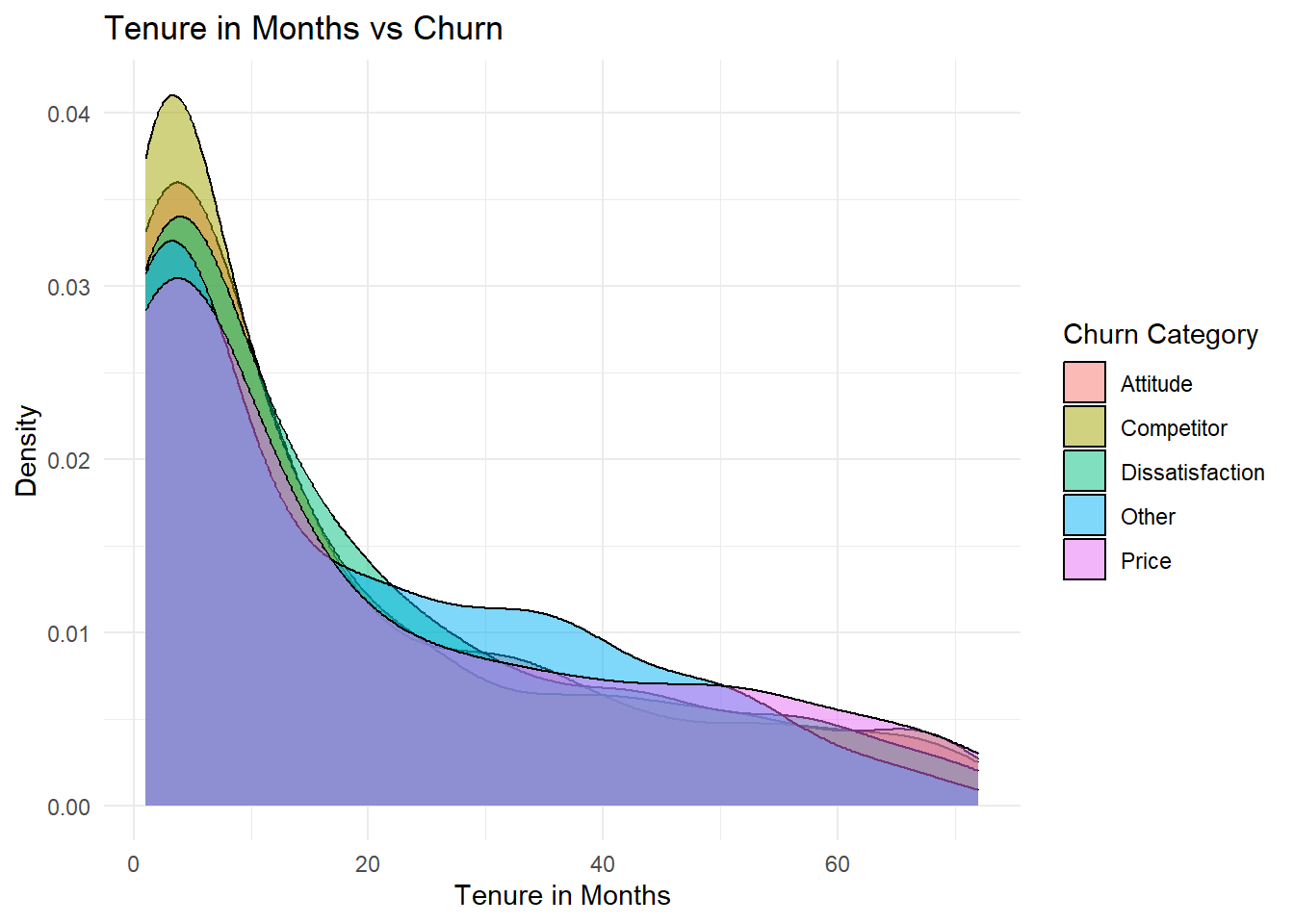
ggplot(cleaned_data, aes(x =`Tenure in Months`, fill =`Churn Category`)) +geom_density(alpha =0.5) +labs(title ="Tenure in Months vs Churn", x ="Tenure in Months", y ="Density") +theme_minimal()
The three graphs reveal interesting insights about churn behavior based on three factors: average monthly download (GB), monthly charge, and tenure in months, each categorized by churn reason.
In the first graph, “Avg Monthly GB Download vs Churn,” we see that users who churn for “Competitor” reasons tend to have higher average monthly data downloads, with a peak around 50 GB. “Attitude” and “Dissatisfaction” reasons appear to be associated with much lower average downloads, with densities peaking around 10 GB and below. This suggests that customers who are dissatisfied with their service or have a poor attitude toward support may not be heavy data users. “Price” and “Other” categories show an intermediate distribution, with price-sensitive customers likely using moderate data.
The second graph, “Monthly Charge vs Churn,” highlights a similar trend. Customers in the “Competitor” category are more likely to churn when their monthly charges are higher, with the peak density around $60-$80. This indicates that competitors offering better prices or more attractive plans are more appealing to higher-paying customers. On the other hand, those who churn due to “Dissatisfaction” or “Price” tend to have lower charges, with the “Price” category peaking around $40. The “Attitude” category shows a spread of monthly charges but leans more toward lower values, suggesting that attitude-related churn may not be heavily influenced by cost.
Lastly, in the third graph, “Tenure in Months vs Churn,” we observe that customers with shorter tenures are more likely to churn for “Competitor” reasons, peaking within the first 12 months. This suggests that competitors are capturing newer customers, likely offering them more attractive deals. Meanwhile, those who churn due to “Dissatisfaction” and “Attitude” show more consistent churn densities across various tenures, peaking at around 20-30 months. This could indicate that dissatisfaction and negative attitudes build over time rather than being tied to a specific stage in the customer’s journey. “Price” and “Other” categories display lower churn densities, especially at longer tenures, indicating that these reasons may be less influential as customers continue using the service.
In summary, the churn patterns reveal that “Competitor” is primarily driven by higher usage, charges, and shorter tenures, while “Dissatisfaction” and “Attitude” appear to correlate with lower usage, charges, and longer customer relationships. “Price” and “Other” reasons seem to be more evenly distributed across usage and tenure, reflecting more complex and less easily categorized reasons for churn.
3.5 Geographic Variables and Churn
Code
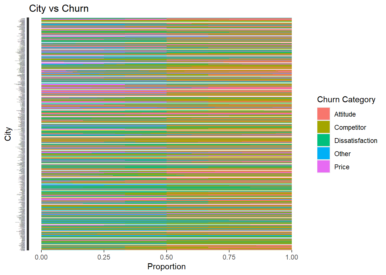
ggplot(cleaned_data, aes(x = City, fill =`Churn Category`)) +geom_bar(position ="fill") +coord_flip() +labs(title ="City vs Churn", x ="City", y ="Proportion") +theme(axis.text.y =element_text(size =1))
Code
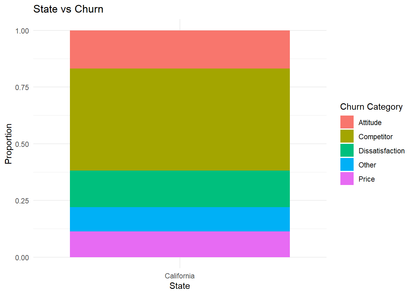
ggplot(cleaned_data, aes(x = State, fill =`Churn Category`)) +geom_bar(position ="fill") +labs(title ="State vs Churn", x ="State", y ="Proportion") +theme_minimal()
The two barplots provide insights into churn categories across cities and states. The first graph, “City vs Churn,” shows the proportion of each churn category for various cities. From this graph, we can observe that “Competitor” churn is quite widespread across many cities, with proportions close to 1 in several cities. However, cities such as “La Cruz” and “Hollis” show a more varied distribution, with churn reasons like “Attitude” and “Price” taking more prominence. This indicates that while competitor-related churn dominates in many locations, other reasons such as dissatisfaction or price issues are more significant in certain areas, highlighting regional variations in the reasons behind customer churn.
The second graph, “State vs Churn,” is focused on the state of California. It reveals that all churn categories—“Attitude,” “Competitor,” “Dissatisfaction,” “Other,” and “Price”—are relatively evenly distributed in California, though “Competitor” churn seems the most common, followed by “Attitude.” This barplot suggests that churn in California may not be as dominated by one specific category as it is in some cities. Instead, the distribution of churn reasons here appears to be more balanced, with several factors contributing to customer churn at similar proportions.
Together, these graphs suggest that while competition-related churn is a dominant factor across both cities and states, regional variations exist in churn reasons. In some cities, factors such as attitude or price issues may play a more substantial role in driving churn, while in California, churn seems to be driven by a more balanced set of reasons. This insight could help businesses tailor their strategies depending on regional differences in customer behavior.